To Rebrand or Not To Rebrand?
When and why some rebranding efforts work
When a new brand logo is introduced, everyone has an opinion.
Suddenly, everyone becomes an expert.
The 102-year-old Jaguar introduced its new brand earlier this week. Within hours, the Internet was up in arms about the rebrand, including Elon Musk.
Jaguar, owned by Tata Motors and part of the Indian Tata Group since 2008, is on life support. It is halting production and sales of new vehicles until its all-new electric model launches in 2026.
The Elon effect is raising awareness. As of 72 hours after the announcement, the teaser ad has been viewed 147.5 million times on X, a number Jaguar couldn’t have imagined. Any press is good press.
This has been everyone’s favorite topic to chime in this week on LinkedIn. It’s no use pouring more hate on it so instead, I will select what I think are successful rebranding cases based on my experience. I have been involved in many such efforts in the marketing and branding industry for over two decades.
1. Citi
This is a famous case in branding and graphic design. In 1988, Citicorp and the Travelers Group merged to become Citigroup. The umbrella mark was a carryover from the Travelers Group’s logo, resulting in a combination of Citicorp’s word mark and the Travelers Group’s umbrella icon.

According to legend, in the first meeting in 2007, Paula Scher, an iconic designer and partner at Pentagram, sketched on a napkin.

A Citi executive asked, “How can it be done in a few seconds?” Paul Scher replied:
“It’s done in seconds and 34 years.”
Nike shoe designer Tinker Hatfield said, “Creativity is a function of the library in your head. When you sit down to create it’s a culmination of everything you’ve done and experienced up to that point.” Well said.
Why I love this rebranding:
Design solving corporate politics: Changing the logo is often a political process, especially in a merger of two mega-organizations like Citicorp and Travelers Group. Ms. Scher’s idea elegantly weaves the two companies’ identities into one simple visual solution.
Thanks to Ned Dwyer and Billy Oppenheimer for the stories and quotes.
2. Instagram
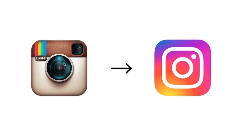
The original logo, designed by photographer/designer Cole Rise, a friend of Instagram’s founder Kevin Systrom, in 2010, was a three-dimensional, tactile icon that provided nostalgia for a digital app. According to Business Insider, Mr. Rise had only an hour to design it since Mr. Systrom had to submit it to Apple’s App Store. It was based on another icon he had created that Mr. Systrom liked.
When the new flattened gradient logo was introduced in 2016, the NY Times ran an article “The Great Instagram Logo Freakout of 2016.” Adweek called it “a travesty.” Not the warmest reception to a rebranding effort. Instagram removed the story about this from its blog.
Despite the harsh reception, Instagram’s growth didn’t suffer. The user base grew from 500 million MAU in 2016 to 2.27 billion MAU in 2022. The Internet freakout lasted a few days and everyone returned to using the app.
Why I love this rebranding:
Harmony between aesthetics and utility: this rebranding wasn’t just about changing the logo. Shortly after the new logo/app icon launch, the Instagram Stories feature was introduced. Around each user’s profile pic, there was a gradient ring, akin to the logo, indicating a new upload (see the image above). It was a subtle yet clear cue that nudged the user to keep checking. The head of design Ian Spalter, an old colleague/friend, is a digital-native designer who understood the harmony between aesthetics and utility. This rebranding is one of the few cases achieving this harmony.
3. Saks Fifth Avenue
This iconic store originated in Washington, D.C. in the 19th century and opened on Fifth Avenue, New York City, in 1924. In 2007, Mr. Michael Bierut and his Pentagram team redesigned its identity and resurrected a script typeface from the old era.
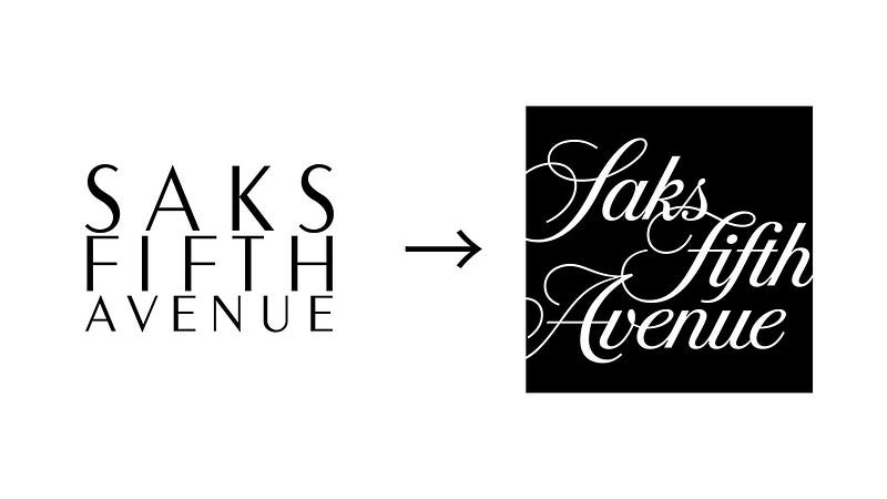
In recent years, multiple high-end fashion brands rebranded, choosing sans-serif typefaces for the word mark in the name of “modern utility,” as explained by Burberry’s Riccardo Tisci. This modernization movement may be the biggest tragedy in the 21st-century fashion industry.

I encountered Mr. Bierut in a meeting for a shared client between Pentagram and R/GA, where I worked, when I was a fledgling designer in my twenties. I remember how eloquently he spoke of brand design, and that’s when I realized design was as much about clear thinking and articulation as aesthetics and execution.

Instead of using a sans-serif typeface to modernize, Mr. Bierut’s team reinterpreted the old script typeface Saks Fifth Avenue used in the 1970s.
Why I love this rebranding:
Being modern isn’t about a typeface: Designers argue for sans-serif typefaces for modernization. However, I love that Mr. Bierut and his team didn’t settle for the lazy utility of a sans-serif typeface. They embraced the brand’s past script typeface and reinvigorated it in a modern way, especially in its applications. I imagine Mr. Bierut articulated the rationale to the client.
4. Uniqlo
[Disclaimer: Uniqlo is a long-time client of my firm I&CO. While we work closely with them, their rebranding occurred before our involvement.]
In 2001, Mr. Tadashi Yanai, the founder and CEO of Uniqlo, decided to expand his business overseas. He opened 21 stores in London. A few years later, it opened in three malls in New Jersey.
The result? A complete failure.
Uniqlo retracted and rethought its approach. Mr. Yanai hired art director Mr. Kashiwa Sato to help rebrand it for the global market.
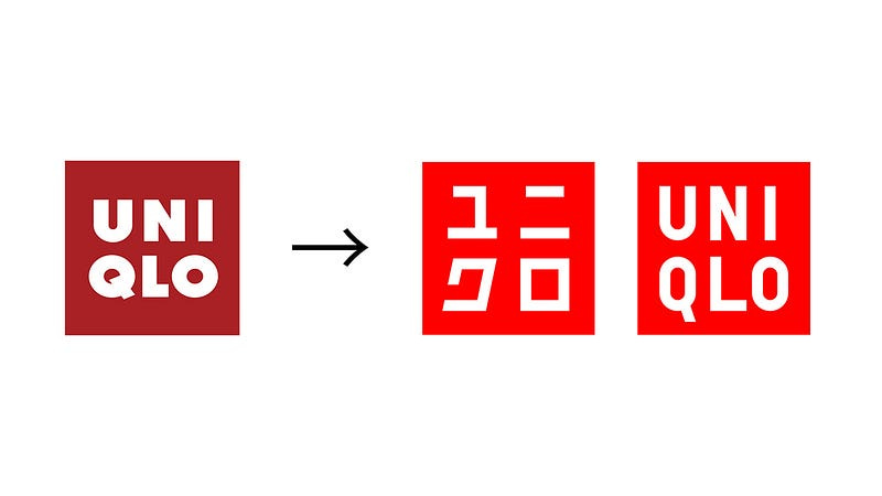
Mr. Sato asked Mr. Yanai if he wanted to let the world know this was a Japanese brand. “Absolutely,” said Mr. Yanai. “I want Uniqlo to be the world’s best brand from Japan.”
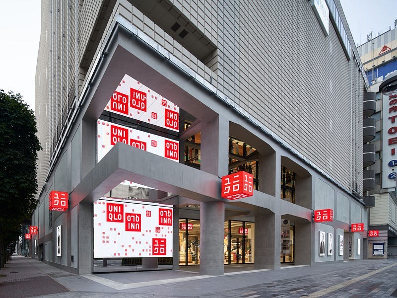
Mr. Sato responded with a new identity incorporating katakana, the Japanese alphabet, into the logo. This was rolled out with Uniqlo’s first global flagship store in Soho, New York in 2006, overseen by Mr. Sato. That was the first successful footprint for the brand outside of Asia and became a template for its global strategy. The rest is history.

Why I love this rebranding:
Business leadership = Design leadership: The close collaboration between a business leader and a designer works well both aesthetically and commercially when successful. An example is Steve Jobs and Jonathan Ive, the former head of design and a collaborator of Mr. Jobs at Apple. Mr. Yanai’s collaboration with Mr. Kashiwa may not be well known outside of Japan but it has been effective and successful.
When is the right time to rebrand?
If necessary, a few triggers may indicate it is reasonable to consider rebranding.
1. Business change
Rebranding can be triggered by a change in business direction, a merger, or global expansion. For Citi, a merger warranted rebranding, and it took eight years. For Uniqlo, global expansion motivated it.
Rebranding goes sideways when the reason is “the new CEO doesn’t like the logo” or “we have a new CMO.” The management change is often not a good trigger for rebranding. The decision to rebrand should be made before the work starts.
2. Product change
Instagram’s product was updated significantly. If the design team had only rebranded the logo and other surface-level assets like the typeface, the rebranding wouldn’t have been successful. It was well integrated into the product and was functionally meaningful, not just aesthetically.
However, this type of rebranding must be done selectively. One should not rebrand each time there’s a product change.
3. Market change
This is the hardest trigger to pull. Like the aforementioned fashion brands, the change was the digitalization of the consumer experience and they all reasoned a rebrand was warranted. The problem is “the best practice” is an easy trap to fall into. That approach could lead to homogeneity, which is exactly what branding shouldn’t do.
One company that pulled this trigger at peculiar timing is the company formerly known as Facebook. In fall 2021, Frances Haugen revealed the Facebook Files, which the Wall Street Journal published, were the perfect storm. To divert attention from its battered image, it rebranded from Facebook to Meta.
Three years after changing its name from Facebook, Meta ranks #97 out of 100 companies in the 2024 Axios Harris Poll reputation rankings, placing just ahead of Spirit Airlines, X, and the Trump Organization.
The "Facebook Files" controversy faded within months after Meta's rebranding, successfully shifting public attention but failing to restore trust in the company.
Having said all this, “When is it the right time to rebrand?”
Rarely.
Manage and build your brand so you don’t have to rebrand.



I used to work with a guy, Andy (rip) who had been a bartender for over 30 years. Any time a liquor or beer bottle would change their branding, Andy would say “welp, sales must be down for ______, that’s why they rebranded”. It’s always stuck in my head since.
Very well said, and presented with excellent, timely examples. Thank you.
Joe Treacy
Director of Typography
Treacyfaces.com